Urik is an app for veterinarians who are looking to improve their inventory management system. I believe Urik can make veterinarians life better by helping them stop wasting precious time they could be treating our beloved animals.
Project overview
Description
Duration
May – September 2022
My role
- UX Designer
- UX Researcher
- Visual Designer
- Graphic Designer
Responsibilities
- Conducting interviews
- Paper and digital wireframing
- Low-fidelity and high-fidelity prototyping
- Conducting usability studies
- Accounting for accessibility
- Iterating on the design
Problem
Some veterinarians, specific small clinic owners, usually manage their inventory by hand, which make things complicated to keep track of all the products they might need for their daily practice.
Solution
To provide a reliable inventory management system where veterinarians can keep track of their products easily in a well organized way, while also having the possibility of restocking and contacting suppliers directly from our app through integration or accessing their own contact list.
Understanding the user
User research
I conducted interviews with some friends and family to understand their frustrations and how that could be overcome. The user group, in this case, is young adults who are starting their career as veterinarians or similar professions.
The user group demonstrate some deep concerns about how easy and reliable long term an app replacement could be.
User pain points
- Users demonstrated they were unhappy about having too much time being wasted managing inventory by hand;
- Users mentioned they would love an application that could help them track their products;
- Users said they need a reliable system that would be guaranteed to keep functioning for years to come;
- Users complained they dislike not being able to restock easily when it’s needed.
Personas
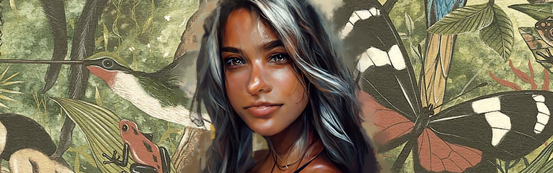
Name: Artemis
Age: 25
Education: Masters in Animal Health and Welfare
Hometown: São Paulo/SP – Brazil
Family: Married
Occupation: Veterinarian
Artemis treats exotic birds from her region in her cozy clinic called “Allura”. She’s currently the only employee in there but she dreams about one day working abroad so she can have the opportunity to see and treat all different kinds of birds. Her passion for animals started when her husband introduced her to the wonders of the animal life through a book called “The Wonders of Life” by Ernst Haeckel.
- To always have at her disposal the best medicines for the animals she treats.
- To stop wasting too much time managing inventory.
- To know when she’s low on clinic supplies.
- “I’m constantly overwhelmed by not knowing how to sort and organize my inventory properly.”
- “I just want to treat my beloved animals and stop wasting precious time with unimportant things.”
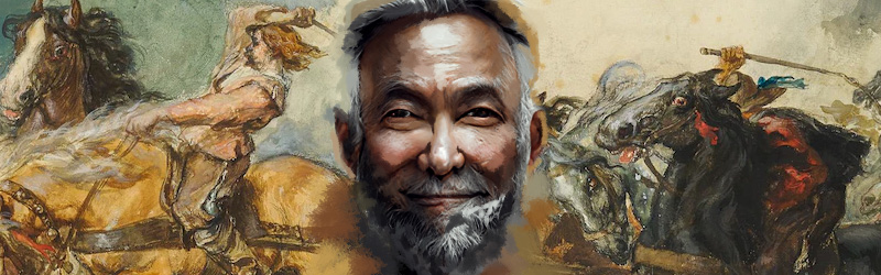
Name: Hoon
Age: 68
Education: Masters in Equine Science
Hometown: Guarapuava/PR – Brazil
Family: Married
Occupation: Veterinarian
Hoon is an old man with a lot of stories to tell. He used to love going with his dad to watch some horse races back in ‘72. Pretty much his entire life is driven by that passion. Nowadays he works in his own farm as a local veterinarian specialized in horse performance. He’s not really good with technology but can definitely use simple apps and are looking forward to include some useful technology in his routine.
- To facilitate the process of organizing all different types of horse foods and supplements.
- To have a way to be notified when he’s low on a specific product.
- “I feel bad when I can’t provide the correct food for my horses just because I’m a messy old man!”
- “I’m not really great with technology, that’s the only reason I’m still managing my inventory by hand.”
Starting the design
Storyboard
1
Artemis is overwhelmed by the amount of products she have to organize and track.
2
Artemis searches online for an inventory managing app for veterinarians (preferably).
3
Artemis finds Urik, gets attracted by its visuals and decides to download it.
4
Artemis begins to organize her products adding everything she already owns followed by its quantity.
5
Artemis buys through the app a couple of products she still needs and configures app’s notifications according to her needs.
6
Now Artemis can focus on her job knowing that the app will provide her notifications whenever a restock is needed.
User flow
User journey map
| Action | Organize inventory | Make a purchase order | Complete order | Receive supplies | Store |
| Task list | A. Check what’s expired and throw it away B. Make a list of supplies that are needed C. Categorize products |
A. Contact manufacturers and distributors. |
A. Check items again B. Provide payment information C. Get the estimated time of supplies’ arrival | A. Take items to the stockroom B. Check if there’s something missing C. Contact suppliers if needed | A. Physically organize products B. Update inventory list |
| Feeling adjective | Overwhelmed by the number of unsorted products | Anxious because they’re taking too long to respond | Annoyed at having to type payment information every new order | Frustrated at not having a direct contact with the supplier | Dissatisfied at having to update inventory list by hand |
| Improvement opportunities | Provide a reliably management system for the products | Provide a way to send the list of products to suppliers automatically | Save payment information for future orders Assist with checkout | Provide option to contact supplier directly from the app | Update inventory automatically after supplies’ arrival |
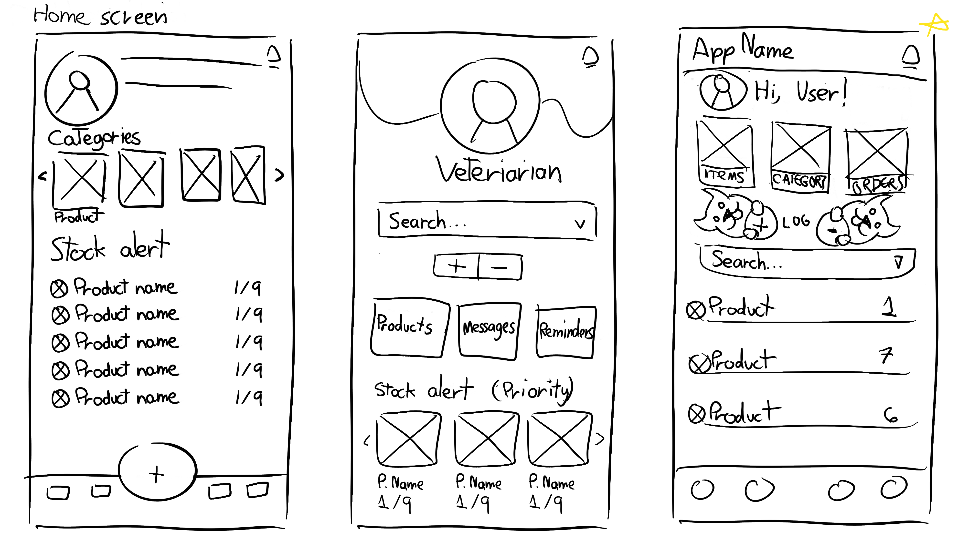
Paper wireframes
My goal here was to try to understand how I could organize the home screen and also the navigation bar before anything else, in order to start making sure my Information Architecture (IA) was correct and intuitive for the users.
Digital wireframes
The entire concept was around giving user access to the most important features with just a few taps on screen. The product details screen specifically was intended to be simple yet highly customizable by the users so they can adjust categories according to their needs.
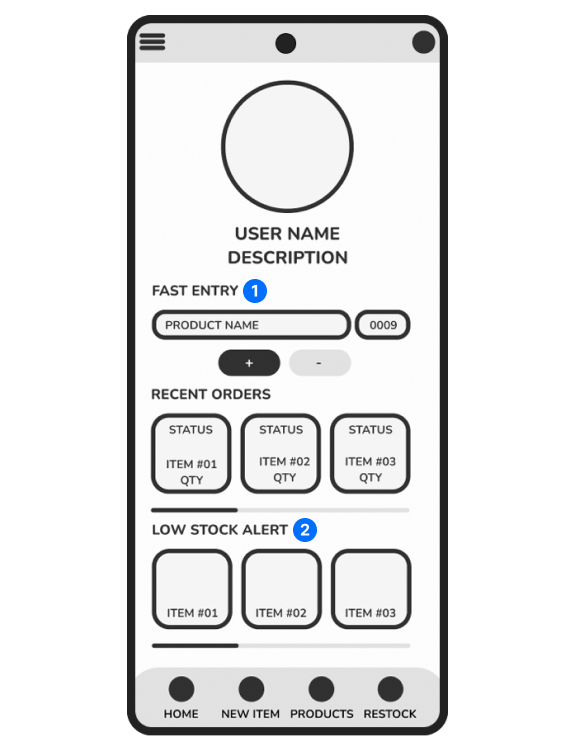
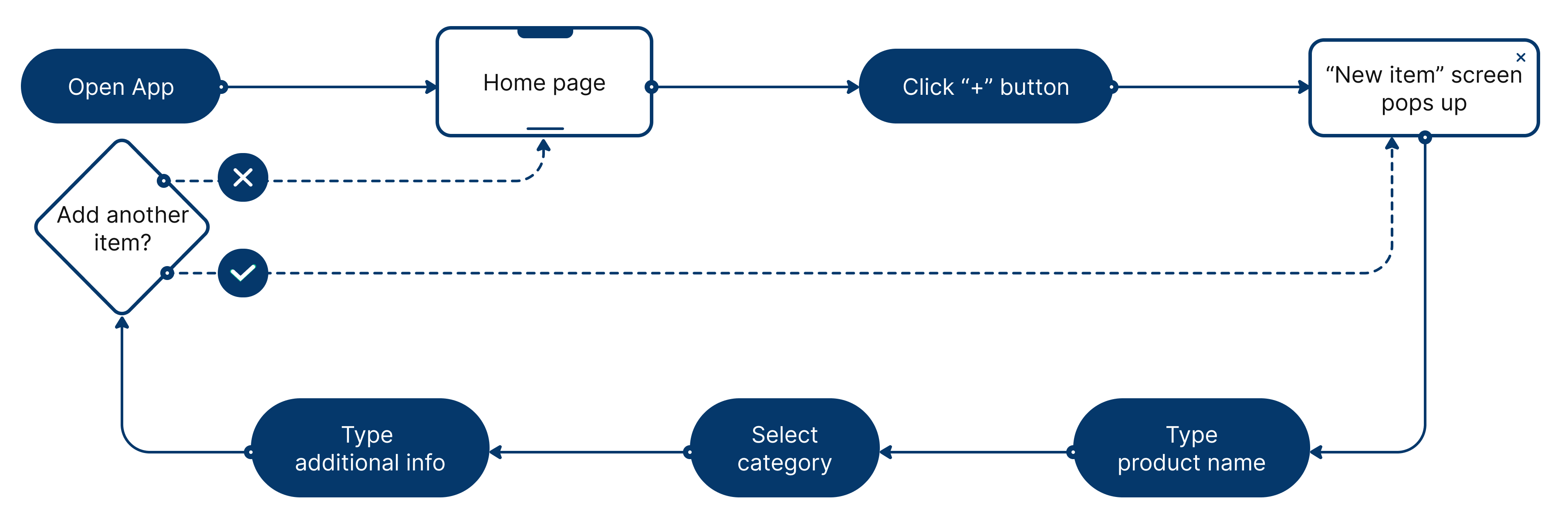
1. Fast entry serves a purpose of being a quick way to update product quantity through home screen
2. Low stock alert is a solution I thought initially to help users have more control over their stock
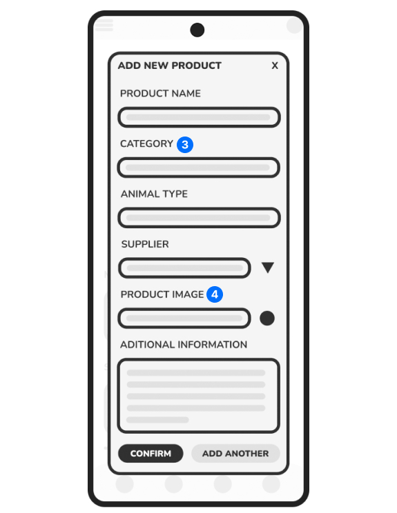
3. Categories should be fully customizable by the users
4. Users can take a photo directly from here or add a pretty image from our gallery
Low-fidelity prototype
The idea here was to have a working prototype to test with users in order to improve before jumping into the mockup.
UX Research: The Study
- Title: Creating Urik, an inventory management system app
- Author: Brunno Andriani, UX researcher, b.andriani@outlook.com
- Stakeholders: Urik customers, Urik CEO and CFO
- Date: 26/06/2022
- Project background: We’re creating Urik, an app to help veterinarians manage their inventory more efficiently, because we noticed that veterinarians who work for themselves or have a small clinic, usually deal with stock manually, so we decided to fill that market gap with a product that can help those professionals by offering a simple yet effective management system.
- Research goals: We’d like to figure out if users would find it useful to have a feature that could help them contact suppliers directly from the app and/or organize their contact’s catalog. Also, specific difficulties and limitations they might encounter when: adding new products, updating stock and setting restock alerts.
- How often do they need to contact suppliers?
- Which kind of contact method do they prefer when contacting suppliers for restock?
- What kind of categories do they use for organizing their products?
- Are there any parts of the adding a new product process where users are getting stuck?
- Are they able to set up restock alerts without too much trouble?
- Time on task: how much time users take for add a new product.
- User error rates: how many categories users need for their products.
- Conversion rates: how many products users are adding to their. inventory.
- System Usability Scale: a questionnaire to evaluate customer feedback.
- Unmoderated usability study.
- Location: Brazil, remote (participants will go through the usability study in their own homes).
- Date: Sessions will take place between July 5-22.
- 8 participants will add 10 of their most used products through the app. Each participant will then complete a questionnaire on their experience.
- Each session will last for 10-15 minutes.
- Participants need to be veterinarians or someone who works for a veterinary clinic
- Participants should include a fairly even distribution of gender and age across the spectrum and people with different abilities including:
- 1 user of visual impairment
- 1 user who isn’t fluent in English
- 1 user of assistive technologies
- Incentive: a $25 electronic gift card they can use with our selected partners upon completion of the questionnaire.
- Prompt 1: From the home screen, add a new product to inventory.
- Prompt 1 Follow-Up: How easy or difficult was it to add a new item to inventory? Is there anything you would change about the process?
- Prompt 2: From the home screen, update one product quantity available in inventory.
- Prompt 1 Follow-Up: How easy or difficult was this task to complete? Is there anything you would change about the process of updating product quantity available in inventory?
- Prompt 3: Update one of your product’s restock alerts.
- Prompt 3 Follow-Up: How easy or difficult was it to update your product’s restock alerts? Is there anything you would change?
- Have the participant complete the System Usability Scale. Participants are asked to score the following 10 items with one of five responses that range from Strongly Agree to Strongly disagree:
- I thought the app was easy to use.
- I think the restock alerts are going to help me immensely.
- I am looking forward to buying my products directly through the app.
- I found the various functions in the app were well integrated.
- I would imagine that most people would learn to use this app very quickly.
- I think that I would use this app frequently.
- I think that having a catalog for my supplier would be an amazing addition to the app.
- I think that I would prefer to call my suppliers instead of texting.
UX Research: Note-taking spreadsheet
This is an example of the method used for take notes during the study.
| Task | Click Path | Observations | Quotes | Task Completion |
|---|---|---|---|---|
|
Prompt 1: From the home screen, add a new product to inventory. Prompt 1 Follow-Up: How easy or difficult was it to add a new item to inventory? Is there anything you would change about the process? |
Open new item page > Click confirm button |
- Participant really liked how quick and easy it is to add new products. - Participant suggested adding a shelf life category to product info. |
"Wait... was it added already?" | Easy to complete. |
|
Prompt 2: From the home screen, update one product quantity available in inventory. Prompt 2 Follow-Up: How easy or difficult was this task to complete? Is there anything you would change about the process of updating product quantity available in inventory? |
Select product name field > Click "+" button | - Participant thought it was pretty intuitive. | "That's pretty easy." "I love it!" | Easy to complete. |
|
Prompt 3: Update one of your product’s restock alerts. Prompt 3 Follow-Up: How easy or difficult was it to update your product’s restock alerts? Is there anything you would change? |
Open stock page > Select category > Click product card > Click notifications > Click update |
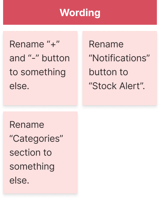
- Participant didn't understand why the button is called "Notifications" instead of "Stock Alert" - Participant said this feature would help her immensely. |
"I can't see myself losing track of my inventory with that feature." | Completed but with difficulty. |
UX Research: Affinity diagram
After conducting the usability study, I grouped the data collected using an affinity diagram in order to find relationships between the answers provided by the participants, so I could make my process of setting priorities easier and also to facilitate my iteration later on.
UX Research: Findings
After conducting the study our findings were mostly positive, users demonstrated to like the app concept and how easy things were to add and manage everything, also, our initial idea of making fully customizable categories for the product detail screen was validated.
Based on enough evidence, the most important themes I concluded were:
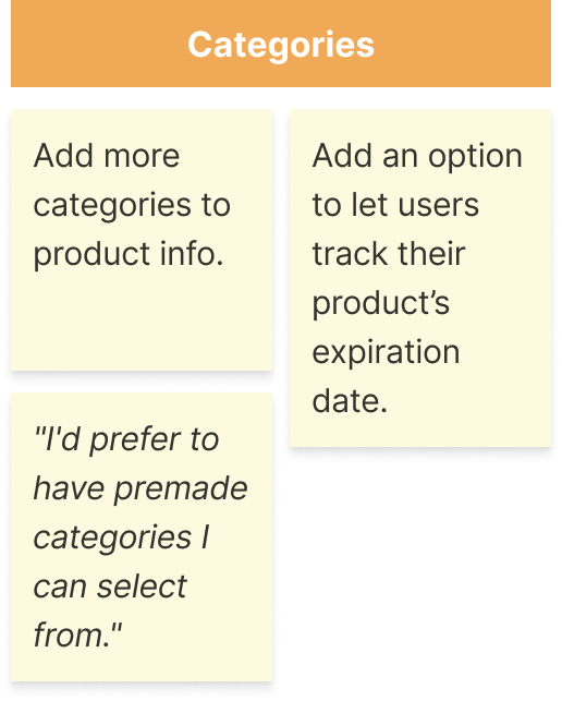
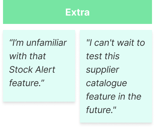
- Users were unfamiliar with the “Stock Alert” feature;
- Users wanted more categories to organize their products;
- Users were confused by some buttons names;
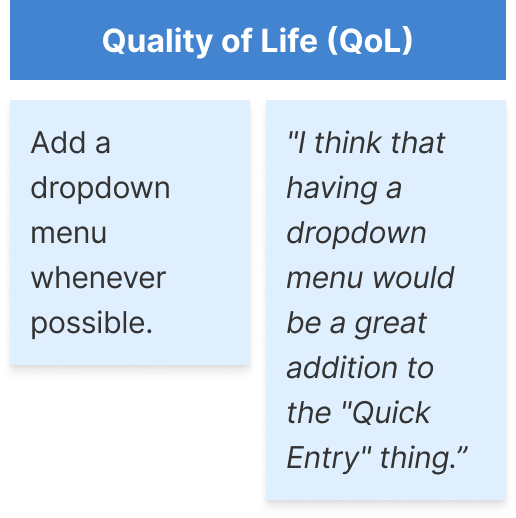
- Users prefer to have a dropdown menu whenever possible;
- Users asked for even more flexibility on the products categories;
- Users demonstrated to be excited to test our suppliers integration feature in the future.
Refining the design
Iteration
After the usability study I realized that the hierarchy needed to be adjusted because users were kind of overwhelmed by the amount of colors and visuals in the app, so I tried to correct that by changing some visuals, also, I believe that having an stock overview is a better solution in comparison to just an alert for how many products they have left.
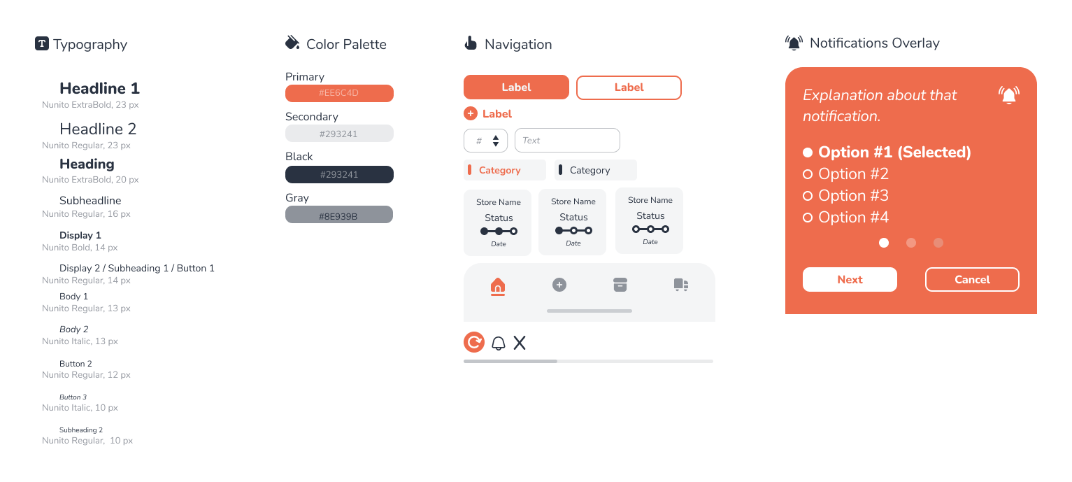
Style guide
Utilizing flat colors felt like a good fit for Urik’s branding. The orange evoke a warm feeling out of users and complemented with neutral colors creates a clean yet pleasant look. The typeface of choice is Nunito. I believe the subtle round look of this font is a perfect fit due to it’s inviting and comfortable look. The navigation componentes are also following the round look to match with the font and the overall Urik’s branding.
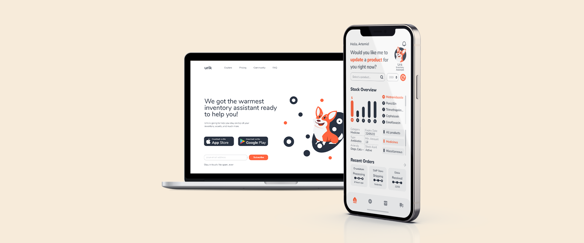
Mockups
More customization and features that will improve general navigation were implemented as well as a better hierarchical structure.
High-fidelity prototype
You can use the temporary truck button on the navigation bar to go back to the splash screen.
Accessibility considerations
Elements that will make everyone’s life better while using Urik:
- Simple to understand icons to help make navigation even easier;
- An assistant that would show relevant information on top of the screen to help all users better understand the design;
- Representations with the first and last letter of each product as default product image to help users who can’t take pictures of their products differentiate and organize themselves better.
Takeaways
Impact
The app makes veterinarians feel like they have an employee – most likely a friend – who can help keep themselves stay organized so they can focus on their practice.
What I learned
While designing Urik, I understood that usually the initial concepts needs to be lapidated before jumping into anything final. Usability studies and peer feedback definitely defined the course of my project by influencing each iteration of the design.
Website
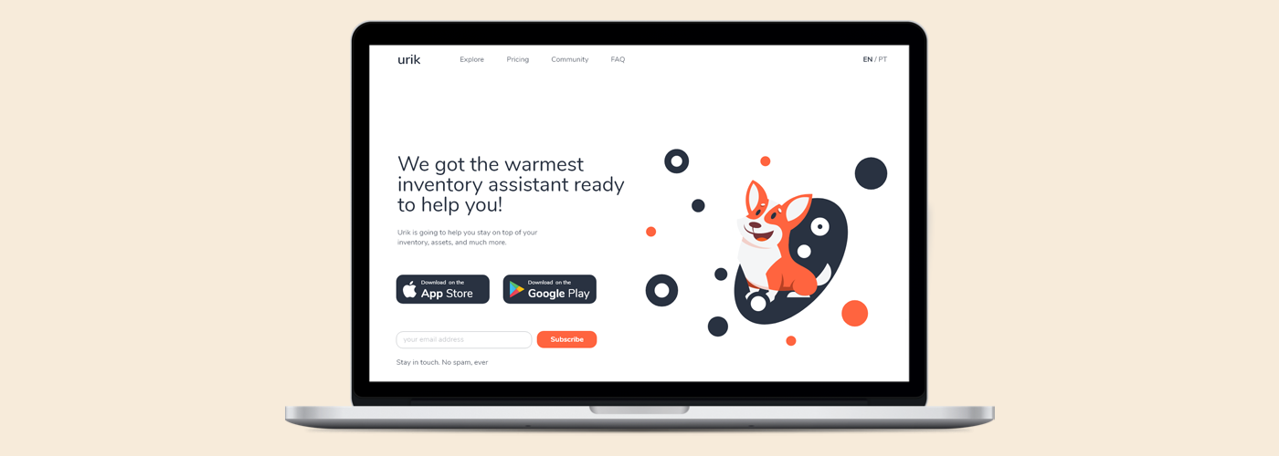
I also designed a simple landing page for the product with an easy navigation, a clear call-to-action button, only relevant information and a form to users sign up for newsletter.
You may check a live preview at urik.brunnoandriani.com.
Tools
Figma
- Sketching
- Wireframing
- Low-fidelity prototype
- Hi-fidelity prototype
- Mockups
Adobe Photoshop
- Graphic Design
- Bitmap illustrations
Adobe Illustrator
- Vector illustrations
Notion
- Research management
- Task management
- Writing
That’s a wrap!
Thank you for reviewing my work on Urik!
Don’t hesitate to contact me if you feel like I can provide any value to your projects.